
Hulu Sign Up Flow - Mobile
Role: Product Designer
Timeline: 3 months
Hypothesis: Including additional value props on the welcome screen can increase sign ups.
Conclusion: Under NDA
Between 2019-2020, I worked on a large variety of experiments and UX improvements to our sign up flow. Everything from slight copy tweaks, to rearranging steps in the flow, to adding small splashes of color. One larger experiment (shown here) was a redesign of the welcome page to include a preview carousel of the top user research-backed value propositions.
Throughout the design process, we critiqued primarily on visual styles that would still feel Hulu-esque while not deviating too heavily from the control welcome screen. Although many concepts were proposed, the final design was decided based on scalability across various iOS devices as well as content licensing terms.

Various visual design explorations (cinematic, content-based, device-based)

Designing for various iOS size classes

Final approved design!
Sign Up Flow - Livingroom
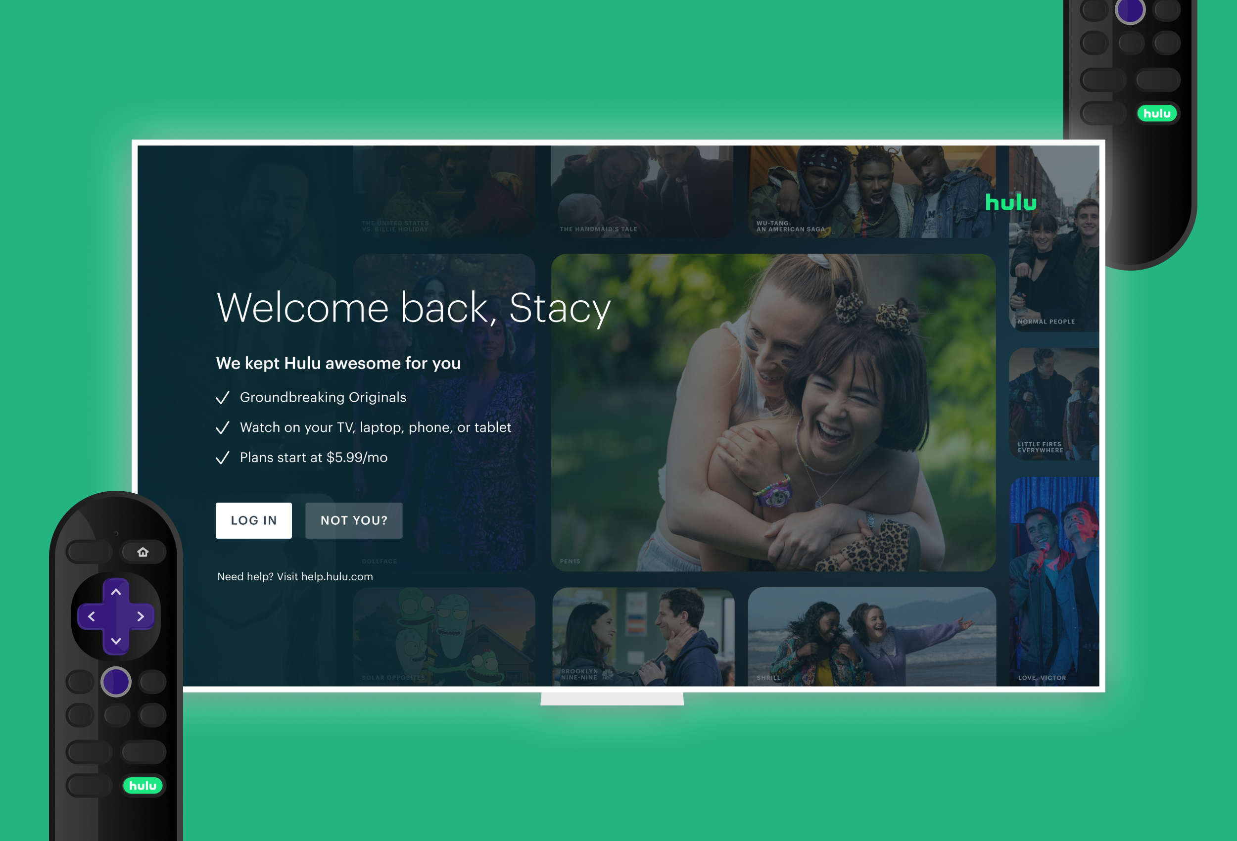
Additionally, during my time at Hulu I worked closely alongside product partners to run experiments through configurable design templates created for our livingroom welcome screens. This allowed us to efficiently test various design elements or full redesigns to measure their effects on sign-up and other growth metrics. One example shown below was an experiment for former subscribers who might be on the fence about re-subscribing.
Role: Product Designer
Timeline: 3 months
Hypothesis: Having a tailored reacquisition experience for former Hulu subscribers can increase sign-ups.
Conclusion: Under NDA

The experiment (left) included updates to copy to welcome back previous subscribers, as well as Hulu content assets
Login experiment remembers the users log in email, and plan selection remembers the user's previous subscription


